First impressions: Brush Pens

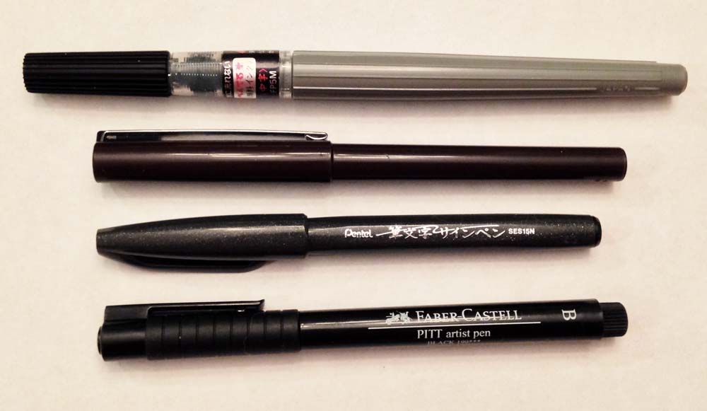
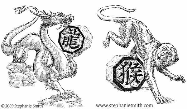
The first part of of my recent shopping expedition to the art store was about the non-brush pens. But the rest of my shopping basket was full of brush pens: self-contained pens designed to emulate using a small brush with ink. Why is that important? The technical pens I usually use are designed to make lines that are always the same width, but that’s not always the look I want. Due to having cats whose instincts are so refined that they believe they can walk across a glass-topped table that’s at a 45° angle (they can’t) using an actual open ink pot is out of the question unless I want to end every art session with a massive ink-spill clean-up. Fortunately I’m not the only one to have this issue, and for folks like me they’ve invented brush pens!

So what did I try this time around?

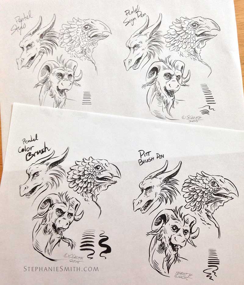
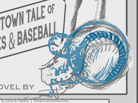
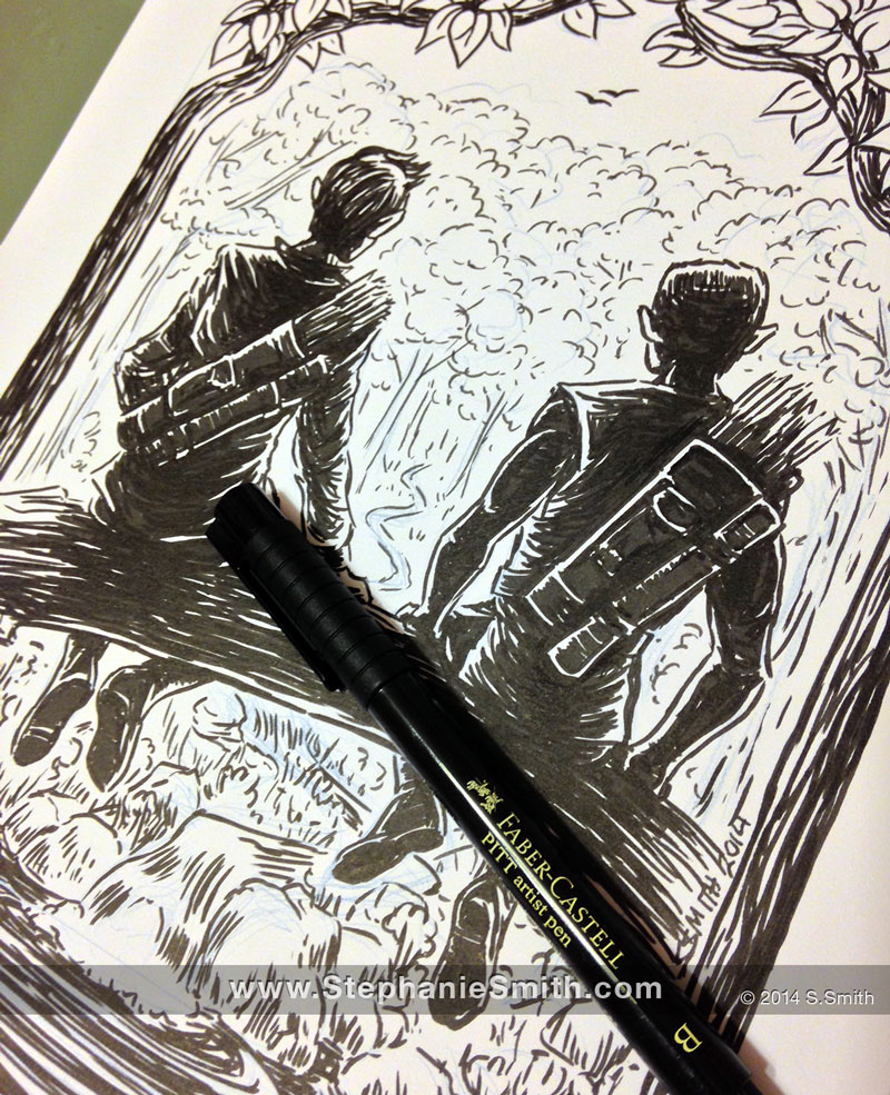
First up, for reference, the Faber-Castell PITT B

Faber Castell PITT B sample
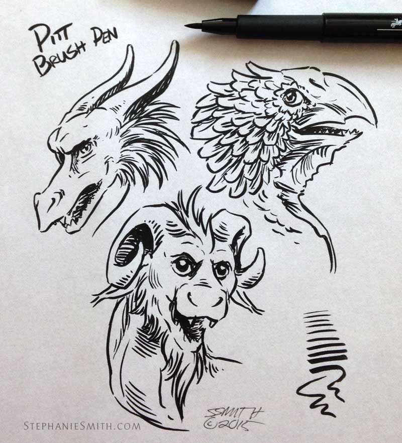
I’ve been using this pen quite a bit lately because of the issues I’m having with the Sakura Brush pens (losing their fine points quickly, fraying if I’m not careful, etc.) so I used it here as a benchmark for comparison. As you can see, it has a pretty wide range from wide to narrow, but it can difficult (not impossible!) to get extremely fine lines.

Faber Castell Pitt B sample details
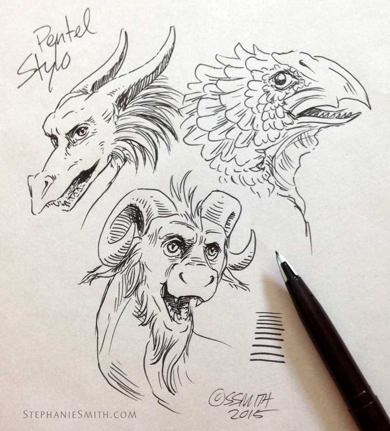
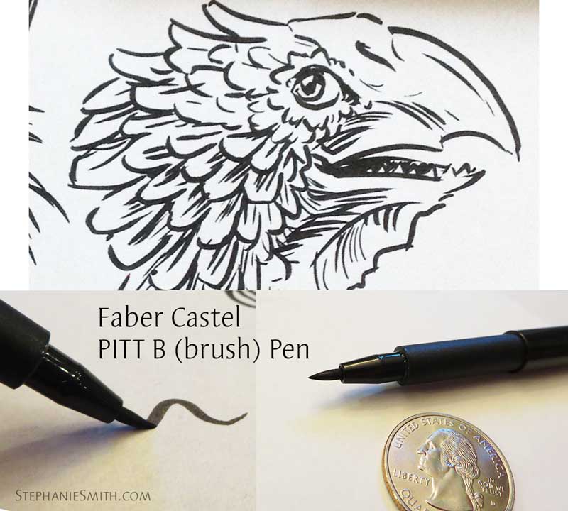
Since it has a flexible solid fiber point, it can get mashed and damaged, but I’ve found it to be relatively sturdy. It’s easier to get extreme line variation by changing the angle and direction of the pen rather than pressing harder so the point bends, but in practice you’d do both. This was a new pen, so it wasn’t broken in very much and started out a bit on the stiff side. It’s very easy to control, but not as expressive as some others. Even though it’s classified as a brush pen it doesn’t handle much like a real brush, it always remains a bit stiff. It uses a waterproof pigment ink so if I want to embellish with watercolor later I can do so without the ink lines bleeding  or smearing. This one has become a familiar and comfortable go-to pen for me.

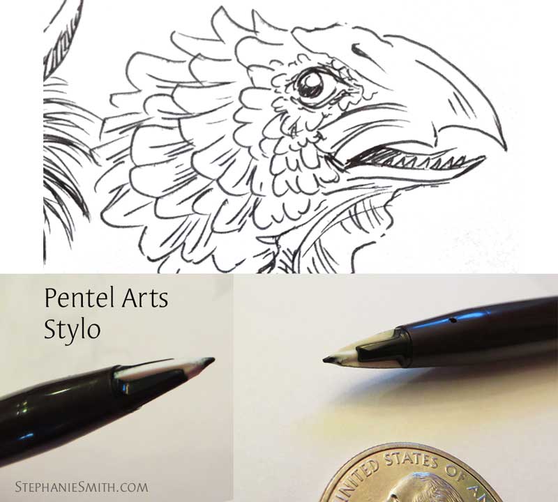
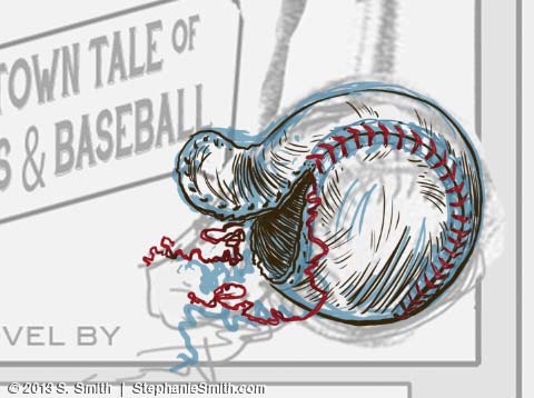
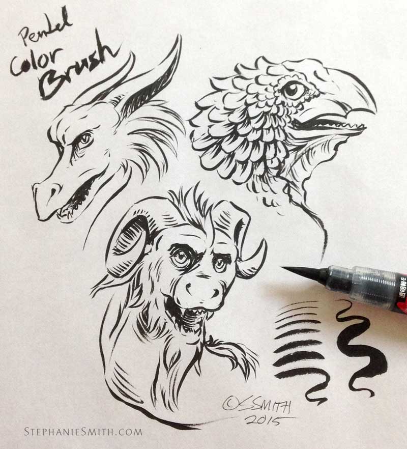
By comparison, there’s the Pentel Arts Color Brush
Pentel Color Brush sampleThis pen has a few distinguishing characteristics:

  • The gray barrel is actually flexible and a little rubbery, so you can squeeze the ink out. So far I only really needed to do that when starting out, since once the ink started flowing it feeds through naturally, thanks to capillary action. (Fortunately the part right near the nib is solid plastic, because I have a tendency to GRIP if I’m not paying attention…)
  • Unlike many brush pens, the brush is a “real” brush, made of fine synthetic hairs, instead of a solid felt or fiber nib… tho this may not be visible in my photographs.
  • This particular model is not refillable, but I believe they make a refillable version.

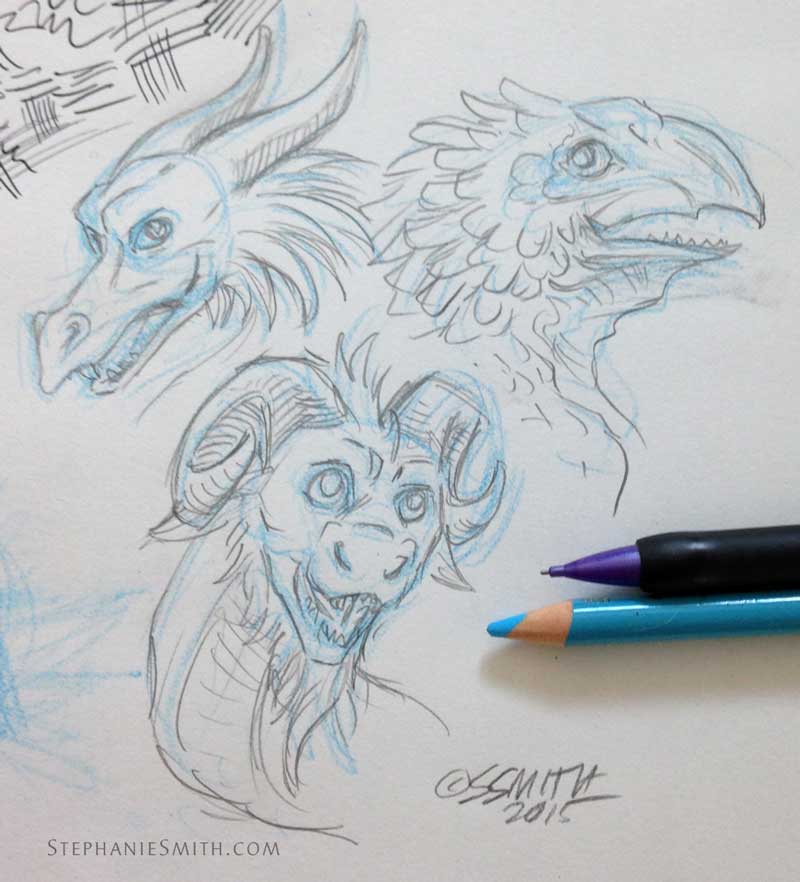
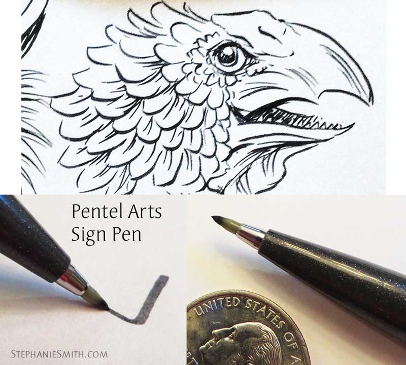
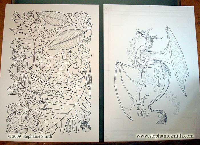
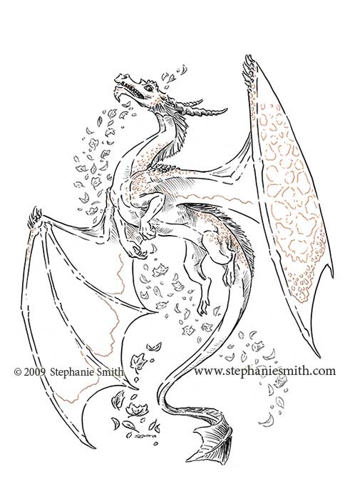
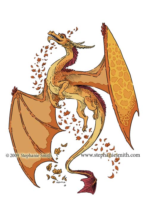
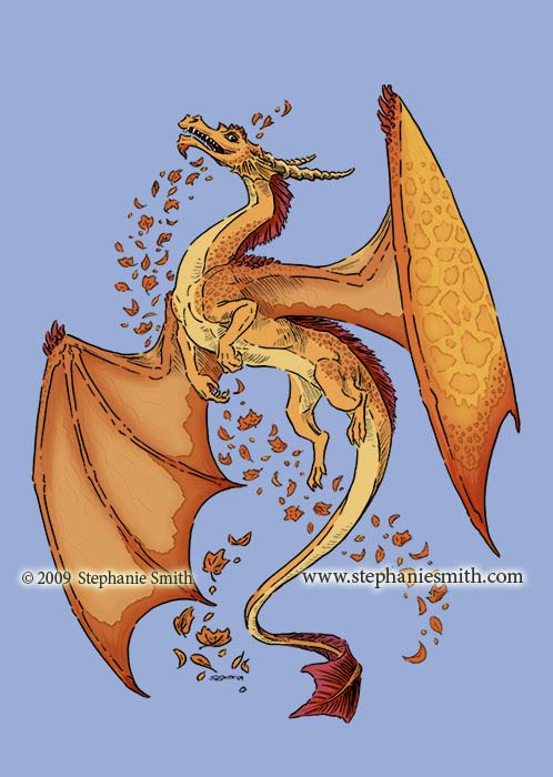
The brush is clearly the standout feature of this pen. I haven’t used an actual brush for a while, so I wasn’t sure how well I was going to handle this one. When I opened it my first reaction was “this brush is way to big for my drawing, it’s going to look completely blobby unless I draw something larger.” Boy was I wrong!  As you can see in the sketch lines above, it has an impressive range, making lines from very fine to wide, even in the same stroke, moreso than the brush pens with a solid nib. Right out of the box, the Color Brush’s synthetic fiber bristles were still white and clean. The pen has a ring to keep the ink inside the storage chamber during shipping, and once it’s removed you have to prime the brush a bit (squeezing the ink out) to saturate the bristles with ink. After just a little bit of doodling it created a smooth, even line. It seems like it’ll need just a bit of a squeeze to re-prime it every time I start using it. Pentel Color Brush sample details
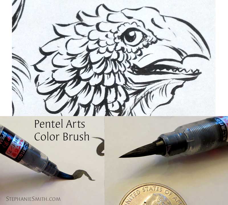
Even after pressing hard enough to make the widest lines the brush springs back very quickly to a fine point. The bristles have just the right amount of give that it offers a lot of control, although it’s still a brush so there’s more wiggle to it than the more pen-like brush pens. This drawing was made mostly with the very tip of the pen with very little pressure, but didn’t need such a light touch that it was difficult to maintain. Using a very hard pressure, it was difficult to maintain a clean, smooth line, so it’s not really something you can use as a mop brush, although it seems like it would do an ok job of filling large areas with solid black. With very little warm-up I was up and running, although I’ll need more practice to feel really proficient. Ordinarily, I’d probably have switched to a technical pen or solid-nib pen for tiny details like the pupils of the eyes — and definitely the lettering! — but I wanted to push my limits. I’m really enjoying this brush, and have been wanting to find a good way to use more real brush-work in my drawing. However, because of the flexibility of the barrel I’d be reluctant to just chuck it into my travel bag like some of my other pens for fear it will become damaged or waste ink. I’ll be practicing more with this one!

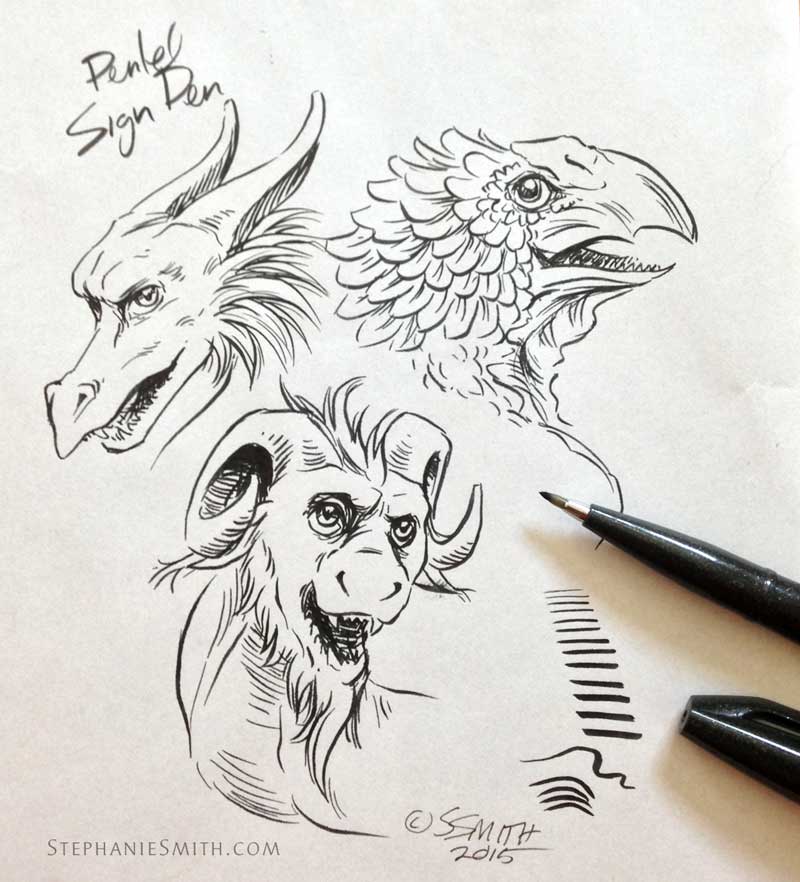
Pentel Arts makes several different brush pens, all with different qualities and features. I picked up a couple more in this same shopping trip, but haven’t opened them all yet, for fear they’ll dry out. But I’m looking forward to trying them all!

First impressions: Pentel Arts pen reviews (Part 1)

I’ve been doing a lot of digital work lately, which I enjoy but in many ways it’s not as satisfying as scraping and smearing pigment across paper. So when the local art supply store was having a sale and a shiny new display of Pentel Arts pens… well, I couldn’t resist. Since I hadn’t used these pens before, I had to try them out to see how they stacked up with the ones I’m used to.

In other words: Yay!!! New shineys!

From top to bottom: Pentel Color Brush (Medium, black pigment ink), Pentel Stylo, Pentel Sign Pen, Faber Castel Pitt B

From top to bottom: Pentel Color Brush (Medium, black pigment ink), Pentel Stylo Sketch, Pentel Sign Pen, Faber-Castell Pitt B

By the way, I’m loving that the Pentels retain their Japanese labelling, even though these are being distributed for the American market. I’m sure that has as much to do with manufacturing costs as it does with their manga-inspired display and packaging.

For reference, the fine art pens I usually have in my arsenal include:

  • Fixed-width technical markers, including Sakura Pigma Microns, Staedtler Pigment Liner, Zig Millenium… whichever brand is on sale at the time. These are great all-purpose pens but require a bit more conscious effort to draw varied line widths, either by drawing over the same line multiple times or switching pens frequently. However, they’re less temperamental and more predictable than brush pens so when I’m in a hurry they’re still my go-to. Even if the rest of the drawing uses a brush pen, these are still better for tiny details like eyes and fingernails, certain patterns, and any time I really need consistent line widths like geometric elements that may require a ruler or template.
  • Sakura Pigma Brush pen has a thin, flexible “felt” marker tip, or nib, that is long and tapered like the shape the bristles of a round inking brush make and produces lines that range from narrow to wide just like a small brush would — at first. The problem is they lose their pointiness VERY quickly, the ends become frayed if you’re not careful, and they seem to dry out fast. When using these, I keep a “fresh” pen in reserve for the finest details and use a broken-in pen for the majority of the drawing.
  • Faber-Castell PITT B brush pen doesn’t have as much flexibility and range or come to as fine a point as the Sakura, but wins out for consistency and longevity. Good for when I’m working on drawings a bit larger size. I used it here as the familiar point of comparison with the new pens I hadn’t use before.

Notably not present: Dip pens, like crowquill, and actual brushes. Why? Both require an open jar of ink, and the last time I used one of those I had to look up how to get ink out of cat fur and how much of it a cat can ingest before you need to be concerned. Since my studio door doesn’t latch well enough to keep overly-curious furry critters out, for now I’m sticking with pens where the ink is safely encased in a cartridge. But I do miss using a brush and have been keeping an eye out for a good solution.

Coming home with my armful of new pens, I needed to give them a practice session to see how they performed. I started out with a quick pencil sketch. Dragons, of course! (Although one of them is a bit beaky and feathery… wait a minute, how did that one slip in?)

Pen test pencil sketch

(Yes, that’s an el-cheapo mechanical pencil from the drug store cuddled up next to my Prismacolor. Don’t judge!)

For the tests I used Marker Rag paper, which is very smooth and slightly translucent, so I could trace over the pencil drawing. That way I’m comparing apples to apples. Thusly:

My husband: "Wait a minute, are you just drawing the same thing over and over again?" Me: "Yes. Don't look at me like I'm crazy, it's a thing!"

My husband: “Wait a minute, are you just drawing the same thing over and over again?”
Me: “Yes. Don’t look at me like I’m crazy, it’s an artist thing!”

First up, the non-brush pens, starting with the Pentel Stylo Sketch    Pentel Stylo sampleI  wasn’t sure what to make of the nib of this pen at first; it was hard to make out from the picture  on the package, which said that it could make both wide and narrow lines. It looks like the white part is made out of some kind of very stiff wicking material, so I assumed you could use the tip for narrow lines and the sides for wide lines, but even after my practice drawing and a ton of just plain scribbling I was able to get only a little variation. More than from the technical pens, which are designed to always be the same width, but not by much. Maybe it needs to be broken in more. This particular pen uses water-based ink, so it’s not waterproof like most of my pens are, but nearly all the Pentel Arts pens were available in your choice of waterproof pigment ink or water-based ink, depending on if you want to use water to blend it or not.

Pentel Stylo sample detailsThis pen handled like a really firm fine-point felt-tip, except it had more drag on the paper. It’ll be ok for sketching or simpler drawings and also writing. It has a firm-fitting cap with a clip on it, reinforcing the idea that it’s for carrying around. I looked online and saw reviews complaining that it spattered a bit, which I noticed too as a bit of roughness in the line (since marker paper is very smooth, the pen lines should be too).  Not what I was expecting, but not a bad pen once expectations are adjusted. I probably won’t be getting another any time soon though. There are cheaper options, like the Paper Mate Flair, for this kind of sketching.

Next up, the Pentel Sign Pen

Pentel Sign Pen sampleIt turns out this is Pentel’s signature pen in Japan, and I can see why. The tip, while not as flexible as an actual brush pen, allows for a wide range from narrow to wide with a lot of control (important when writing traditional calligraphy, and it letters nicely in english too!) The ink is nice and dark; I bought it in the waterproof pigment variety, which means the lines shouldn’t bleed if I want to add watercolors or color markers on top later. Like the Stylo, the cap snaps on nice and tight, so it should travel well and hopefully won’t dry out too quickly. It’s hard to see in any of my photos, but the barrel is ever so slightly hexagonal rather than round and also tapers near the tip, which makes it a little easier to hold despite having a very slick surface. And the flat-ish sides mean it’s less likely to roll away when you set it down for a just a second without the cap oh my gosh where’d the pen go it’s going to dry out did it go under the table is the cat eating it argh argh argh. Not like that sort of thing ever happens to me. Ahem. Moving on.

Pentel Sign Pen sample detailsThe nib of the Sign Pen has a little bit of give to it, but most of the line variation comes from controlling the angle and direction of your stroke. The nib is slightly conical so the wider lines come from drawing sideways and narrow lines from drawing with the tip. The nib feels a lot firmer than a typical felt-tip marker and seems like it will last at least as long as the ink does, unlike some pens I’ve used. Time will tell. I have a feeling that with a bit more practice I’ll get better range and expressiveness out of it, but the firm nib means it’s less temperamental and more predictable than a brush tip. It’s narrower but has a similar range as the PITT B, which is an actual brush pen that will be featured in the next post. In the meantime, I’ll probably be adding this pen to my travel bag for sketching, I’m liking it so far!

Next time: the brush pens!

Making a Book Cover: Plug Ugly Ball part 2

When we left off at the end of Part 1, I had a client-approved layout sketch and color scheme. Now it’s time to turn that into a real book cover!

Plug Ugly Ball Cover - Final SketchIf you’ve seen any of my other art-process entries, you know I usually draw the actual illustrations on good old-fashioned paper before scanning them into the computer to add color and other details. This time, however, I used a completely digital workflow for the final art for two reasons:

1. While the interior illustrations were reminiscent of newspaper and fine-art engravings from the time period, which made them a good candidate for ink drawing, the cover illustration was meant to evoke posters and other signs, which tended to be painted in bold colors or use woodblock printing. Which would have required tools that would be difficult for the next reason…

2. Part of the time I’d be working on this, I’d be traveling. Keeping everything digital meant that all I had to bring with me was my laptop and drawing tablet instead of a bag of art supplies.

For digital artwork I typically use the Adobe products — mostly Photoshop but others as needed — and a Wacom Intuos drawing tablet.

First, I opened my sketch in Photoshop and used the drawing tools to redraw sections of my source drawing that I wasn’t happy with, like this baseball.

Baseball Drawing - SketchThen, on another layer, I drew in the linework, just as I would have with a real pen. This is the final version; I didn’t take screenshots as I went along, so I had to go into the different finished layers to pull out the samples for this article. Which means you don’t get to see all the erasing and redrawing and erasing and redrawing etc etc… lucky you!

Baseball Drawing - "inks"Finally, on a layer that went underneath all the others, I filled in a flat area of color and then added shading. Each element of the illustration was drawn separately and then all the layers grouped together in a “smart object” so they’d be easy to resize, move around, and add effects to.

Baseball drawing - ColorsOnce I had all the hand-drawn parts finished, I started in on the frame. I couldn’t find any patterns that would work 100% from my clip-art collection, so I built my own in Illustrator. This program makes it easier to make geometric shapes and build repeating patterns, so after I figured out the basic shape I wanted, I drew it in Adobe Illustrator and turned it into a symbol that could be copied as many times as I needed.

Vector Frame Drawing - SymbolsOther details were drawn in, including using the “dashed line” feature to make these little raised dots.

Vector Frame Drawing - DetailsThere were a couple other elements that proved easier to draw in Illustrator, like the picture frames in the corner, and the banner for the subtitle. All of these pieces were then copied into my Photoshop file as Smart Objects, just in case I needed to open them again in Illustrator to make changes — and boy did I! Here, the images on the left are in Illustrator and the last image on the right is in Photoshop, where you can see here how I’ve started layering in textures so it doesn’t look too crisp and clean.

Vector Frame SequenceAs the artwork started coming together — including adding the text (the font is the lovely HandShop from Fontscafe) — I needed to adjust some of the proportions and positions.

Plug Ugly Ball Cover - ArtworkNow that I have all of the main pieces of artwork done, it may seem like it’s pretty much finished, but now it’s time for all the details that really make the cover come together: textures, shadows, shading, and other adjustments. But those will have to wait for the next installment!

UPDATE: Continue the story with Part 3!

“A Moment of Reflection” in progress

Preliminary client sketches for a commissioned illustration

This recent commission was for a black-and-white image to be used as the cover for a short fantasy story, “Why,” written by Maggie Allen for author Janine Spendlove and published by the creator-run Silence in the Library Publishing as part of a Kickstarter backer bonus. The story is a bittersweet character study that takes place in Spendlove’s “War of the Seasons” fantasy universe. I worked with both Maggie and Janine to make sure I captured the style and spirit of the characters and setting.

Moment of Silence in-progressFor this drawing, I used the Pitt brush pen. I needed to work quickly and the brush pen is a good compromise between detail and speed. Although I used my light table to trace from the sketch, you can see in this picture where I made a few final adjustments in blue pencil before committing the drawing to ink.

Want to see the final product? Head on over to my Behance page! That’s where new finished artwork will be showing up, so if you’re a community member there Follow me to be updated when I add new work.

Making a Book Cover: Plug Ugly Ball, Part 1

 As followers of this blog know, I recently had the pleasure of illustrating the book Plug Ugly Ball: A Mobtown Tale of Bullies and Baseball, including the design of the book’s cover. Here’s a little peek inside the process.

Plug Ugly Ball book photo

Like any other illustration or design project, this one started with a long conversation with the client (in this case, author John Everett) about what he needed and wanted. Since I had just completed the interior art for his book, I was already familiar with its subject matter and themes. My client wanted to be sure his cover evoked those same themes and the time period the story is set in: the late Victorian era in the American East.

After a bit of additional historical and market research, I hit the sketchbook and filled up several pages with ideas about layout and typography, integrating some of the visual elements my client specifically wanted. They included more formal, structured concepts similar to the printed matter of the time as well as more pictoral concepts built around the ballpark and painted outdoor signage.

Taking into account current trends in book design and the need to avoid making it look like it belonged in the non-fiction section, I worked up four of the most likely ideas in rough form and sent them to my client. He wanted the cover to reflect the parallel in his story between the old Plug Ugly Gang and the rough-and-ready days of the early baseball league in Baltimore, so his favorite concept was the one that took that very literally, seen below on the left.

With his comments in mind I refined the design further. Ultimately we included some period art of the city itself as an inset and a few visual motifs from the other versions I’d presented. As the design came together, I started integrating color, producing a set of different colorways for the client to pick from. Some of the palettes were authentic to the time period, pulled from vintage advertisements — they were more vivid options, in fact — while others just “feel” more antique to a modern viewer.

Now that I had an approved design, it was time to start making the artwork. But that will have to wait for the next post!

EDIT: Part Two is now online!

MORE snow? Only the good kind.

 Snowflakes #2
click to enlarge

I’m still hard at work on a last “winter” project for the season, a companion piece to the Dragon of Autumn. I posted the scanned ink drawing a few posts ago, and here’s the colored version. My poor hand was a bit cramped after all of these snowflakes! But they’re only one small part of the whole project. I’m currently much further along than this, but I don’t want to post any “spoilers” just yet. 🙂

I’ve been really enjoying my new computer… working on the Dragon of Autumn was painfully slow, with files taking up to 20 minutes to save, even with separate elements like the frame and textures in separate files to keep the file sizes as small as possible. Now I’m working on an even larger file and there’s almost no lag at all. Ahhh, so nice! Now the only thing slowing me down is everything else in my schedule! But I hope to finish this one by next week, so I can turn my thoughts to warm, sunny, springtime…

Snow Days!

Snowflakes
click to enlarge

Like the rest of the Mid-Atlantic, this week our house was covered in an awful lot of the stuff pictured above. Fortunately, in between a LOT of shoveling and some neglected housework, I still had the energy to get caught up on some of my drawings. I guess there are some good things about being snowed in! The above is some of the artwork that will be used in the next piece in my “Dragons of the Year” series; go ahead, guess what season it’s for. 😉

I’ve actually made a fair bit of progress, and I’ll be posting bits of it over the next couple of weeks until its finished. Right now I can’t wait to start working on “Spring!”

Thanksgiving wishes

Happy Thanksgiving! I hope everyone out there (whether or not you live in the US where it’s being formally and nationalistically observed) has a moment this week to spend with their family and/or friends and reflect on all of the good things in their life. I have quite a long list myself, including my wonderful extended family, all of my dear friends (both online and offline) and my dear husband and the life we’ve been building together. I love that I have the freedom to pursue my art and maintain a comfortable life at the same time, and am grateful for all of the blessings, large and small, that have filled my life. I just finished making pies for tomorrow’s dinner with my husband watching goofy old movie serials on our little kitchen TV and you know what? It’s a pretty good way to end the day. Especially taking into account that the rest of the day was spent cleaning the whole house because we’re hosting Thanksgiving dinner tomorrow.

Chinese Zodiac Preview — The Ox and The Pig

I don’t have any more thematic artwork to post at the moment (we’ll see if I get a chance tomorrow, but it seems unlikely) but I thought that regular visitors to my blog would appreciate seeing a little work-in-progress. Yes, I have finished ALL of the ink drawings for my Chinese Zodiac series: The Ox, The Pig, The Dragon, and The Monkey. The Ox is actually a re-drawing of the Ox I did way back at the beginning this year, the first of the series (since this IS the year of the Ox) but I decided it just didn’t hold up to the rest of the drawings I did since then. Two of these are partially colored, and the only one that should take an exceptionally long time is The Dragon — I just can’t help throwing all the bells and whistles into a Dragon, after all. 🙂

Chinese Zodiac Preview — The Dragon and the Monkey

I don’t know about anyone else, but as much fun as I’ve had doing these (and they have been very fun) I will be happy when they’re done. I’m a bit eager to start in on the next project. I’ll be posting shiny new color versions of the whole series everywhere as soon as they’re done… with any luck in the next couple of weeks!

Have a great holiday, those that are having one!

An animated step-by-step

It’s been a busy week, but I wanted to post this little extra tidbit to follow on from last week’s post where I described the process I followed to make this image. Here are the same steps, now in fancy animated gif format. It might take a little while to load, so sit back and enjoy!

Dragon of Autumn — Animated GIF

Feeling that Autumn Vibe…

To make up for the short break in my posting schedule, I have something a little extra today: a work-in-progress breakdown of how I produced my latest image.  All of the images below can be clicked for a larger view.

(Or, if you want you can just skip ahead to the finished product!)

First, after figuring out most of the details in pencil first, I use my light table to help create the ink drawing. I’ve been using a brush-pen lately, using the fixed-width Micron pens only for the fine details.

Dragon of Autumn — original ink drawings

As you can see, the leaves were all drawn out separately, because I think I want to reuse them on a future project.

Next the ink drawings are scanned in and cleaned up a bit in Photoshop. I worked on paper that was 17×12 inches because that’s the largest size that will fit on my scanner. My A3 scanner is my current favorite “toy” because it lets me draw larger without having to piece things together after scanning them in sections, saving me SO much time and hassle. Here you can see where I’ve tinted some of the lines where I wanted a more subtle effect.


Dragon of Autumn — ink drawing scan

Next, I blocked in the color areas with flat colors. Doing this first simplifies things a lot later on, when I can use the wand tool to isolate different areas. Usually I put the ink drawing on a separate layer set to “multiply” so the white areas become invisible and color on the layer beneath it. Keeping everything on separate layers make it so much easier to make changes later if I need to.


Dragon of Autumn — flat colors

Adding details to the color is next. At this point I put an approximation of the final background color in, because a plain white background makes it very hard to figure out the correct tonal range and color balance.


Dragon of Autumn — color details

Now I start adding shadows and highlights on separate layers. This is where it really starts taking shape. I always use the shading I already included on the ink drawing as my guide, but because I knew I’d be adding shadows at this step I didn’t do much crosshatching where the more subtle shadows would be.

Dragon of Autumn — shading

Next it’s time to consider the background. The leaves were all colored separately, so I could arrange them however I liked. Because my file sizes were getting very large, I built the leaf frame in a separate file and then copied it into the main file with the dragon.

Dragon of Autumn — leaf frame

The leaves were overwhelming the dragon, so I faded everything back a little bit to make sure they stay in the background.

Dragon of Autumn — leaf frame part 2

It’s almost done, but I felt there was something missing. I wanted to add a little bit of texture to everything, to give it the feel of real autumn leaves. So I broke out my watercolors and made some nice, crinkly textures, which I then scanned in.

Watercolor Textures

And now, with the textures layered into place, the image is finished!

Dragon of Autumn — final artwork

Smile for your closeup… there’s a good dragon!

Dragon of Autumn — close-up detail

Buy art This image is available for sale on prints, cards and T-shirts at my RedBubble site… check it out!

I learned a couple of things working on this project:

  1. I really like working the textures into my ink drawings, I think it adds a dimension that was missing before.
  2. I also liked working with really bright, vivid colors instead of soft tints all the time.
  3. I really need to invest in a new computer, my little Powerbook was gasping as I was creating all of the colors in hi-res and the extra layers from the texture files didn’t help matters. By the end the file was taking almost 20 minutes to save.

For most of my color illustrations, I have downsampled the scan file to a lower resolution to make the colors, and then upsampled the finished color layers back into the full-resolution ink scan. The full-resolution color file tends to be massive (this one would have been well over 1GB if I’d kept everything in a single file) and that approach minimizes how much I have to work with such a huge file. The drawback is that the upsampling softens the colors a bit giving them a watercolor feeling I don’t always want. This time I tried to do everything in the high-resolution file so it’d stay sharp and bright, but it made my computer run painfully slow.

This was a little divergence from my zodiac series, but it was a refreshing one. Now, back to work!

UPDATE:  If you just can’t get enough step-by-step excitement, I’ve also made an animated GIF showing this sequence… in motion!