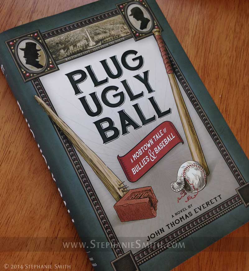
As followers of this blog know, I recently had the pleasure of illustrating the book Plug Ugly Ball: A Mobtown Tale of Bullies and Baseball, including the design of the book’s cover. Here’s a little peek inside the process.
Like any other illustration or design project, this one started with a long conversation with the client (in this case, author John Everett) about what he needed and wanted. Since I had just completed the interior art for his book, I was already familiar with its subject matter and themes. My client wanted to be sure his cover evoked those same themes and the time period the story is set in: the late Victorian era in the American East.
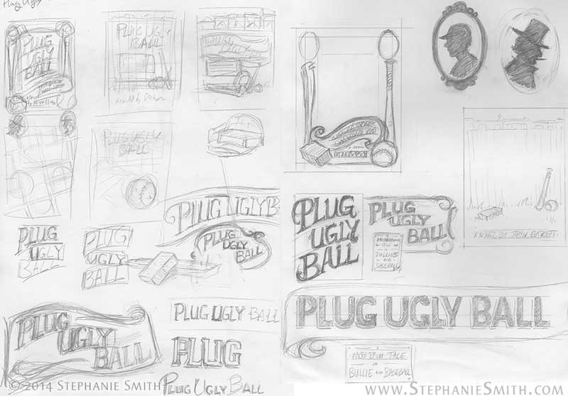
After a bit of additional historical and market research, I hit the sketchbook and filled up several pages with ideas about layout and typography, integrating some of the visual elements my client specifically wanted. They included more formal, structured concepts similar to the printed matter of the time as well as more pictoral concepts built around the ballpark and painted outdoor signage.
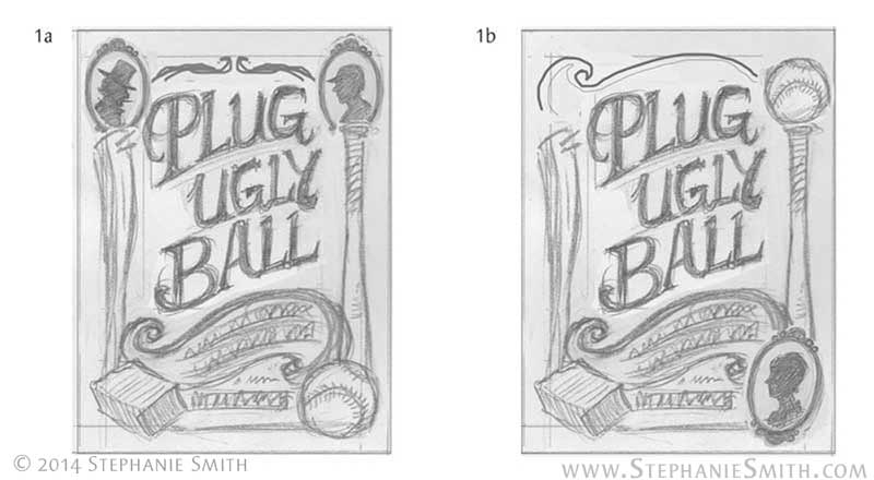
 Taking into account current trends in book design and the need to avoid making it look like it belonged in the non-fiction section, I worked up four of the most likely ideas in rough form and sent them to my client. He wanted the cover to reflect the parallel in his story between the old Plug Ugly Gang and the rough-and-ready days of the early baseball league in Baltimore, so his favorite concept was the one that took that very literally, seen below on the left.
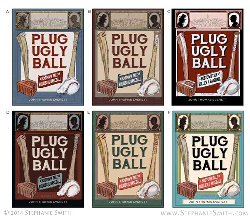
 With his comments in mind I refined the design further. Ultimately we included some period art of the city itself as an inset and a few visual motifs from the other versions I’d presented. As the design came together, I started integrating color, producing a set of different colorways for the client to pick from. Some of the palettes were authentic to the time period, pulled from vintage advertisements — they were more vivid options, in fact — while others just “feel” more antique to a modern viewer.
 Now that I had an approved design, it was time to start making the artwork. But that will have to wait for the next post!
EDIT: Part Two is now online!