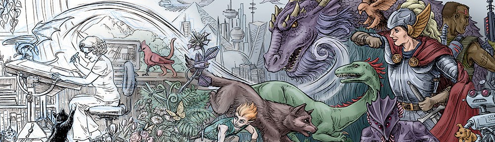
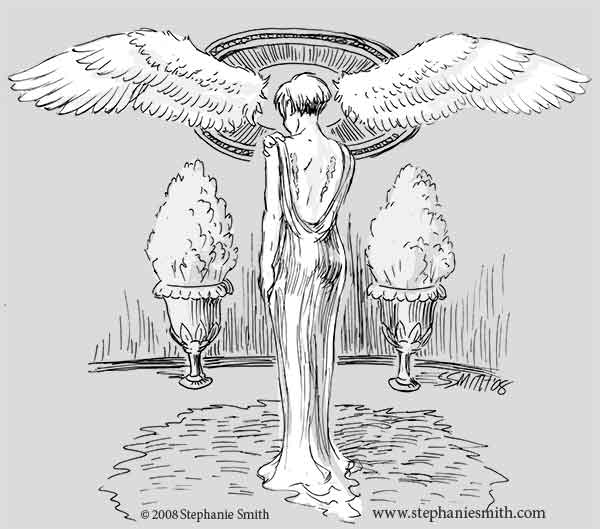
A slightly surreal image for this weeks Illustration Friday topic. When I thought of the idea it was a bit more lighthearted and tongue-in-cheek, but I only had a couple hours to work on it and this is what came out instead. Click the image to enlarge it.
This drawing and the one before were done on sheets of drafting vellum an almost-transparent paper with a fairly slick surface, almost plastic-like. Its very prone to smudging so it forces a light, quick touch. I experimented with it a while ago and it makes for really crisp lines. but I find it difficult to scan; the transparency means the ink lines tend to cast a shadow behind them on the scanner which is hard to remove without obliterating the finer lines. I suppose a film scanner might solve that problem, but it’s easier just to use another medium instead.
Since I was rushing, I made a major error in the ink drawing: The shading on the background had the light coming from the opposite direction as the figure in the foreground. I made some halfhearted attempt to fix it on the paper, and then decided that this was what Photoshop is for. I flipped the figure after scanning it (a bit clumsy with the masking, Im afraid) and voila! Might have worked better if I hadn’t tried fixing it in ink first. It would have been even better if I hadnt made the mistake in the first place!
Very nice. I gives me a 1920s/1930s feel.
Wow. This is beautiful. Very beautiful. I love the 20’s feel. It’s a very strong illustration, and AGAIN, beautiful.
This is a gorgeous drawing! I love the vintage quality, too. Thanks also for sharing your process—those of us trying to learn appreciate the details!
so beautiful…