I’ve been doing a lot of digital work lately, which I enjoy but in many ways it’s not as satisfying as scraping and smearing pigment across paper. So when the local art supply store was having a sale and a shiny new display of Pentel Arts pens… well, I couldn’t resist. Since I hadn’t used these pens before, I had to try them out to see how they stacked up with the ones I’m used to.
In other words: Yay!!! New shineys!
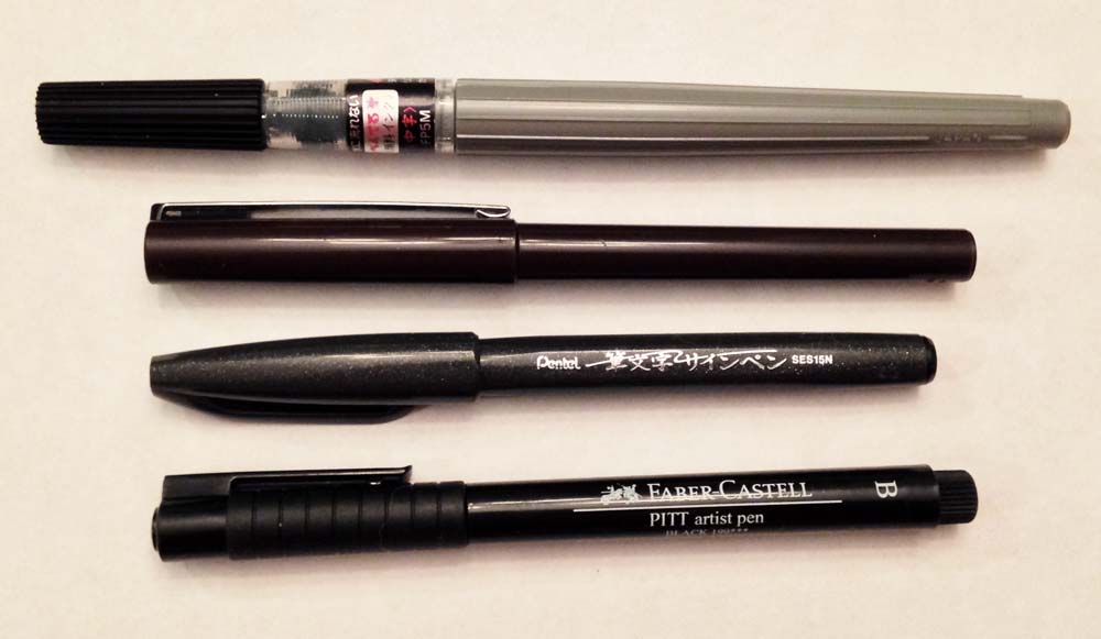
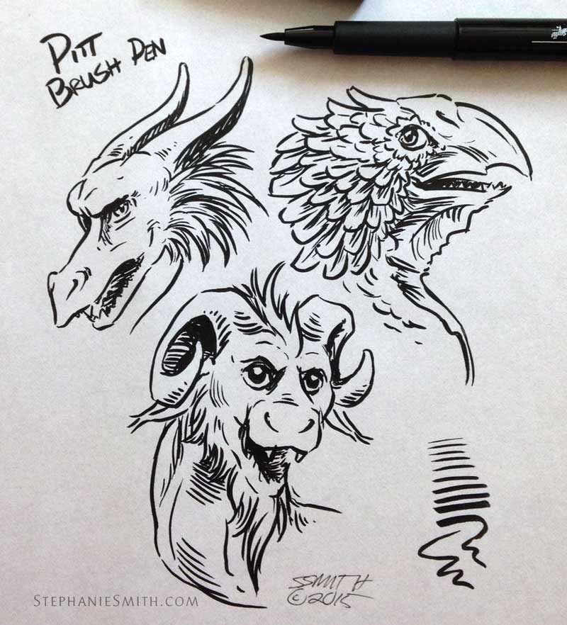
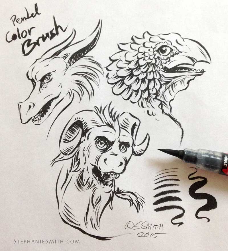
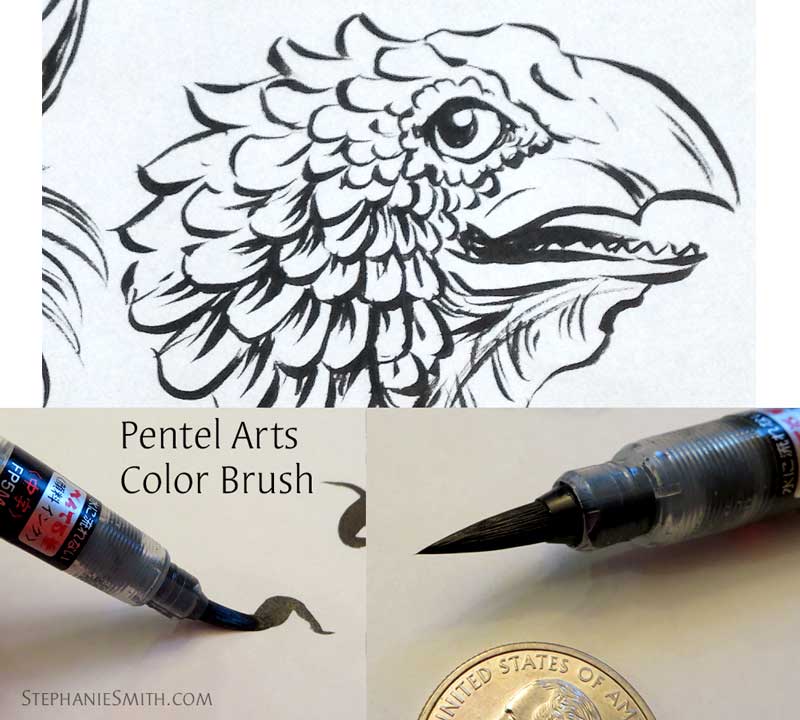
From top to bottom: Pentel Color Brush (Medium, black pigment ink), Pentel Stylo Sketch, Pentel Sign Pen, Faber-Castell Pitt B
By the way, I’m loving that the Pentels retain their Japanese labelling, even though these are being distributed for the American market. I’m sure that has as much to do with manufacturing costs as it does with their manga-inspired display and packaging.
For reference, the fine art pens I usually have in my arsenal include:
- Fixed-width technical markers, including Sakura Pigma Microns, Staedtler Pigment Liner, Zig Millenium… whichever brand is on sale at the time. These are great all-purpose pens but require a bit more conscious effort to draw varied line widths, either by drawing over the same line multiple times or switching pens frequently. However, they’re less temperamental and more predictable than brush pens so when I’m in a hurry they’re still my go-to. Even if the rest of the drawing uses a brush pen, these are still better for tiny details like eyes and fingernails, certain patterns, and any time I really need consistent line widths like geometric elements that may require a ruler or template.
- Sakura Pigma Brush pen has a thin, flexible “felt” marker tip, or nib, that is long and tapered like the shape the bristles of a round inking brush make and produces lines that range from narrow to wide just like a small brush would — at first. The problem is they lose their pointiness VERY quickly, the ends become frayed if you’re not careful, and they seem to dry out fast. When using these, I keep a “fresh” pen in reserve for the finest details and use a broken-in pen for the majority of the drawing.
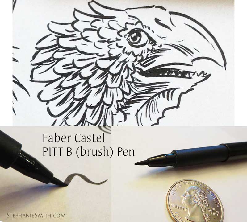
- Faber-Castell PITT B brush pen doesn’t have as much flexibility and range or come to as fine a point as the Sakura, but wins out for consistency and longevity. Good for when I’m working on drawings a bit larger size. I used it here as the familiar point of comparison with the new pens I hadn’t use before.
Notably not present: Dip pens, like crowquill, and actual brushes. Why? Both require an open jar of ink, and the last time I used one of those I had to look up how to get ink out of cat fur and how much of it a cat can ingest before you need to be concerned. Since my studio door doesn’t latch well enough to keep overly-curious furry critters out, for now I’m sticking with pens where the ink is safely encased in a cartridge. But I do miss using a brush and have been keeping an eye out for a good solution.
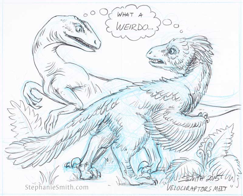
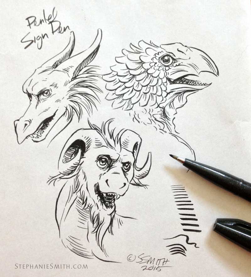
Coming home with my armful of new pens, I needed to give them a practice session to see how they performed. I started out with a quick pencil sketch. Dragons, of course! (Although one of them is a bit beaky and feathery… wait a minute, how did that one slip in?)
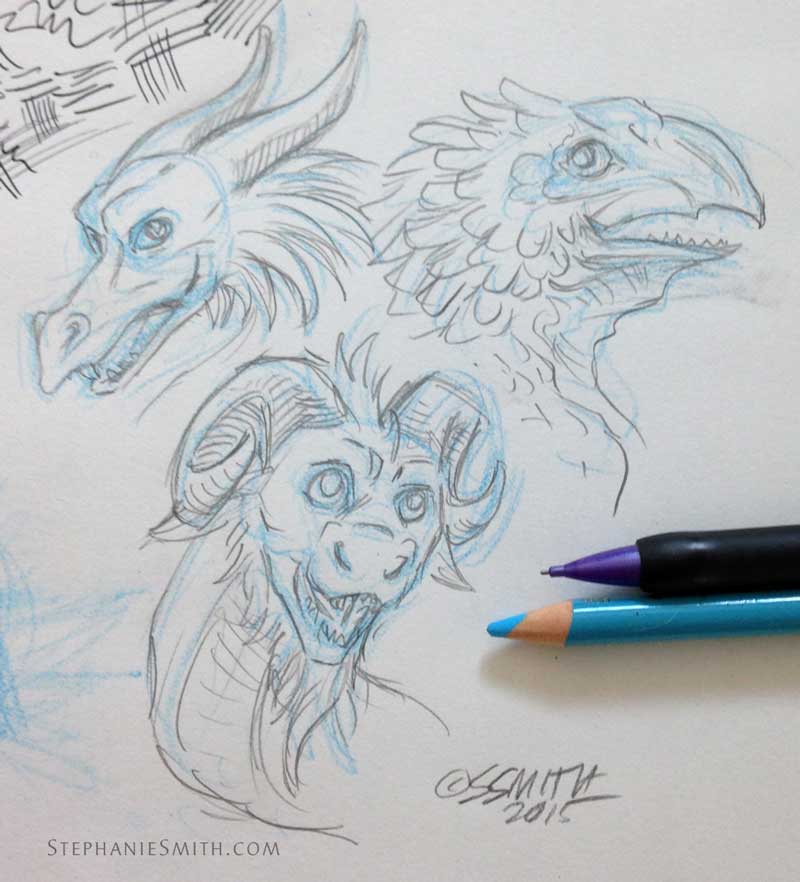
(Yes, that’s an el-cheapo mechanical pencil from the drug store cuddled up next to my Prismacolor. Don’t judge!)
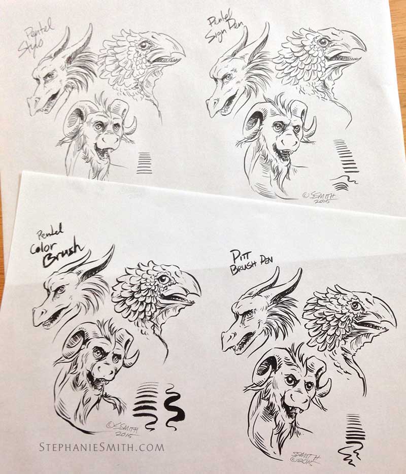
For the tests I used Marker Rag paper, which is very smooth and slightly translucent, so I could trace over the pencil drawing. That way I’m comparing apples to apples. Thusly:
My husband: “Wait a minute, are you just drawing the same thing over and over again?”
Me: “Yes. Don’t look at me like I’m crazy, it’s an artist thing!”
First up, the non-brush pens, starting with the Pentel Stylo Sketch 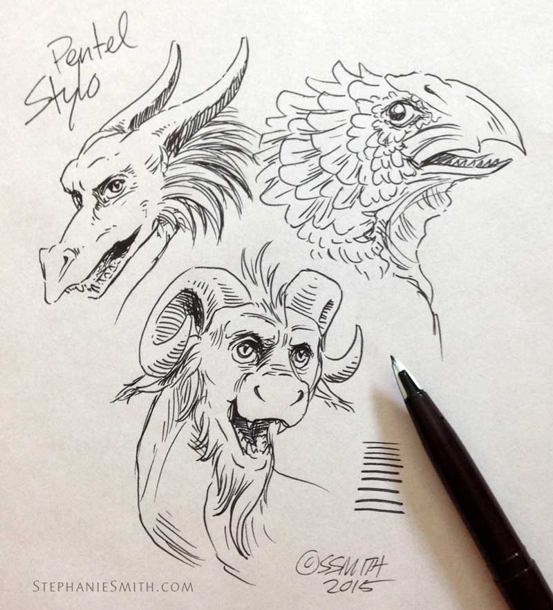 I wasn’t sure what to make of the nib of this pen at first; it was hard to make out from the picture on the package, which said that it could make both wide and narrow lines. It looks like the white part is made out of some kind of very stiff wicking material, so I assumed you could use the tip for narrow lines and the sides for wide lines, but even after my practice drawing and a ton of just plain scribbling I was able to get only a little variation. More than from the technical pens, which are designed to always be the same width, but not by much. Maybe it needs to be broken in more. This particular pen uses water-based ink, so it’s not waterproof like most of my pens are, but nearly all the Pentel Arts pens were available in your choice of waterproof pigment ink or water-based ink, depending on if you want to use water to blend it or not.
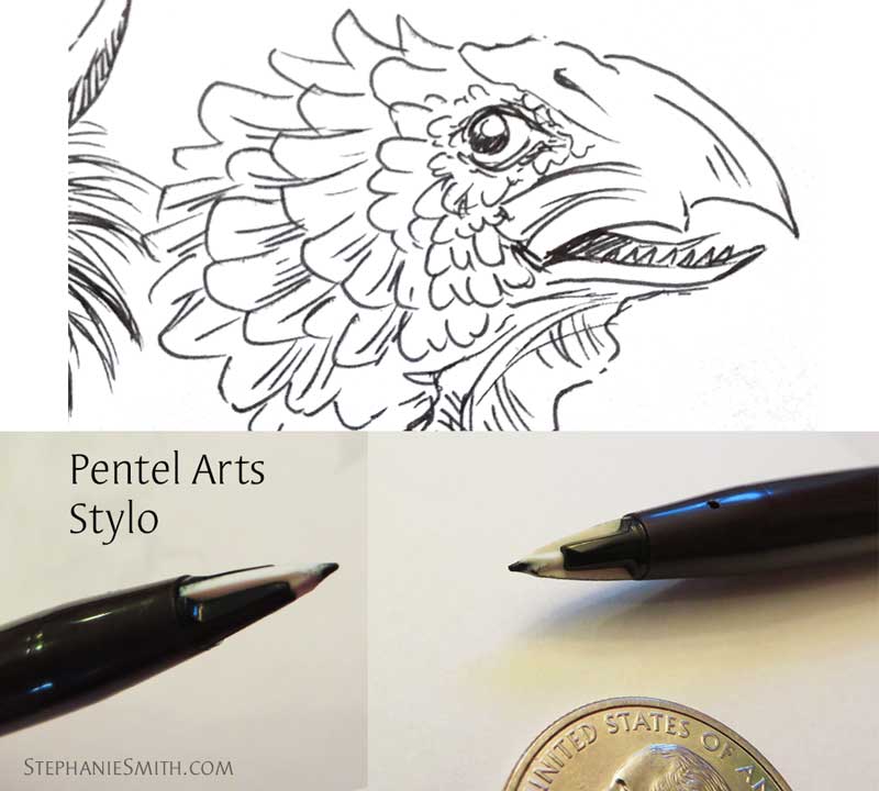 This pen handled like a really firm fine-point felt-tip, except it had more drag on the paper. It’ll be ok for sketching or simpler drawings and also writing. It has a firm-fitting cap with a clip on it, reinforcing the idea that it’s for carrying around. I looked online and saw reviews complaining that it spattered a bit, which I noticed too as a bit of roughness in the line (since marker paper is very smooth, the pen lines should be too). Not what I was expecting, but not a bad pen once expectations are adjusted. I probably won’t be getting another any time soon though. There are cheaper options, like the Paper Mate Flair, for this kind of sketching.
Next up, the Pentel Sign Pen
 It turns out this is Pentel’s signature pen in Japan, and I can see why. The tip, while not as flexible as an actual brush pen, allows for a wide range from narrow to wide with a lot of control (important when writing traditional calligraphy, and it letters nicely in english too!) The ink is nice and dark; I bought it in the waterproof pigment variety, which means the lines shouldn’t bleed if I want to add watercolors or color markers on top later. Like the Stylo, the cap snaps on nice and tight, so it should travel well and hopefully won’t dry out too quickly. It’s hard to see in any of my photos, but the barrel is ever so slightly hexagonal rather than round and also tapers near the tip, which makes it a little easier to hold despite having a very slick surface. And the flat-ish sides mean it’s less likely to roll away when you set it down for a just a second without the cap oh my gosh where’d the pen go it’s going to dry out did it go under the table is the cat eating it argh argh argh. Not like that sort of thing ever happens to me. Ahem. Moving on.
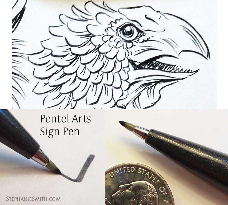 The nib of the Sign Pen has a little bit of give to it, but most of the line variation comes from controlling the angle and direction of your stroke. The nib is slightly conical so the wider lines come from drawing sideways and narrow lines from drawing with the tip. The nib feels a lot firmer than a typical felt-tip marker and seems like it will last at least as long as the ink does, unlike some pens I’ve used. Time will tell. I have a feeling that with a bit more practice I’ll get better range and expressiveness out of it, but the firm nib means it’s less temperamental and more predictable than a brush tip. It’s narrower but has a similar range as the PITT B, which is an actual brush pen that will be featured in the next post. In the meantime, I’ll probably be adding this pen to my travel bag for sketching, I’m liking it so far!
Next time: the brush pens!