When we left off at the end of Part 1, I had a client-approved layout sketch and color scheme. Now it’s time to turn that into a real book cover!
 If you’ve seen any of my other art-process entries, you know I usually draw the actual illustrations on good old-fashioned paper before scanning them into the computer to add color and other details. This time, however, I used a completely digital workflow for the final art for two reasons:
1. While the interior illustrations were reminiscent of newspaper and fine-art engravings from the time period, which made them a good candidate for ink drawing, the cover illustration was meant to evoke posters and other signs, which tended to be painted in bold colors or use woodblock printing. Which would have required tools that would be difficult for the next reason…
2. Part of the time I’d be working on this, I’d be traveling. Keeping everything digital meant that all I had to bring with me was my laptop and drawing tablet instead of a bag of art supplies.
For digital artwork I typically use the Adobe products — mostly Photoshop but others as needed — and a Wacom Intuos drawing tablet.
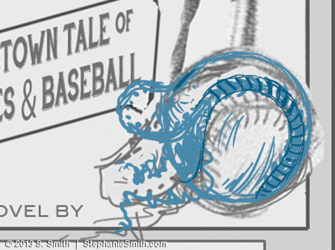
First, I opened my sketch in Photoshop and used the drawing tools to redraw sections of my source drawing that I wasn’t happy with, like this baseball.
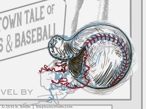
 Then, on another layer, I drew in the linework, just as I would have with a real pen. This is the final version; I didn’t take screenshots as I went along, so I had to go into the different finished layers to pull out the samples for this article. Which means you don’t get to see all the erasing and redrawing and erasing and redrawing etc etc… lucky you!
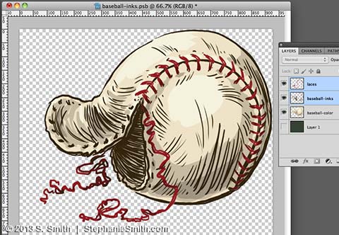
 Finally, on a layer that went underneath all the others, I filled in a flat area of color and then added shading. Each element of the illustration was drawn separately and then all the layers grouped together in a “smart object” so they’d be easy to resize, move around, and add effects to.
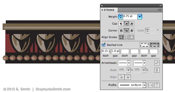
 Once I had all the hand-drawn parts finished, I started in on the frame. I couldn’t find any patterns that would work 100% from my clip-art collection, so I built my own in Illustrator. This program makes it easier to make geometric shapes and build repeating patterns, so after I figured out the basic shape I wanted, I drew it in Adobe Illustrator and turned it into a symbol that could be copied as many times as I needed.
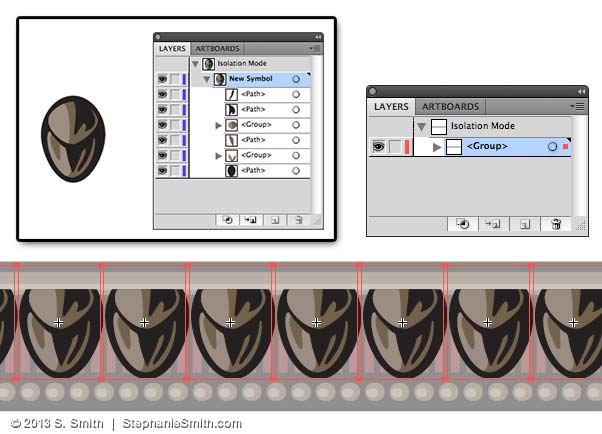 Other details were drawn in, including using the “dashed line” feature to make these little raised dots.
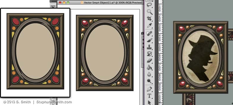
 There were a couple other elements that proved easier to draw in Illustrator, like the picture frames in the corner, and the banner for the subtitle. All of these pieces were then copied into my Photoshop file as Smart Objects, just in case I needed to open them again in Illustrator to make changes — and boy did I! Here, the images on the left are in Illustrator and the last image on the right is in Photoshop, where you can see here how I’ve started layering in textures so it doesn’t look too crisp and clean.
 As the artwork started coming together — including adding the text (the font is the lovely HandShop from Fontscafe) — I needed to adjust some of the proportions and positions.
 Now that I have all of the main pieces of artwork done, it may seem like it’s pretty much finished, but now it’s time for all the details that really make the cover come together: textures, shadows, shading, and other adjustments. But those will have to wait for the next installment!
UPDATE: Continue the story with Part 3!

Pingback: Making a Book Cover: Plug Ugly Ball, Part 1 | Scribbles & Scribings
Really nice work Stephanie, great article as well, both of them. I loved reading about your process! 🙂
Thanks Jimmy! The process is always changing, depending on the project, but I like to keep all the tools in my belt handy and this one used a lot of them. The last part – layout – should be up next week 🙂
Pingback: Making a Book Cover: Plug Ugly Ball, part 3 | Scribbles & Scribings