Happy Birthday, America!

© 2015 Stephanie Smith

© 2015 Stephanie Smith

It’s America’s birthday, so let’s celebrate!

I didn’t have any cake, so instead I had some fun playing around with a few new digital tools and techniques. I based the eagle-riffic portions of this digital painting on one of the amazing wildlife photos taken by Lawrence Ten Eyck, used with his permission.

Velociraptors!

© 2015 Stephanie Smith

I hope you’re enjoying your summer! Guess which summer popcorn movie with dubious scientific underpinnings I went to see last week? Jurassic World was a fun flick (although not without some serious plot flaws) but some paleontologists were not as amused: the current science says that critters like Velociraptors would actually be much pudgier and probably covered in some kind of feathers, virtually unrecognizable as the same critters from the movie. Which gave me the idea for this sketch!

I’ve always had a soft spot for dinosaurs and the original Jurassic Park totally blew me away when I first saw it in the theater. It was the first time we actually saw on the big screen the active and social dinosaurs that I’d read about in books like The Dinosaurs: A Fantastic View of a Lost Era by William Stout (I still have my well-thumbed copy of the original printing!) instead of the slow, plodding behemoths of the past. But that was 20 years ago, and paleontology has advanced a lot since then: the movement against “shrink-wrapped dinosaurs” (art that focuses mostly on the bone structure and discounts musculature, skin flaps, and fatty tissues) and concrete discoveries about pigmentation and feathers are starting to change the representation of dinosaurs again. And there’s enough evidence out there to back it up that the Jurassic World even hung a lampshade on the fact that their dinosaurs don’t measure up to scientific scrutiny.

Mine’s not particularly accurate either — I drew it too large, for starters, and the proportions are off — but as much as I like drawing my boney, scaly dragons I also love the idea of a world full of crazy, colorful, feathery dinosaurs.

Pencil sketch on bristol, with blue pencil underdrawing, © 2015.

Making a Book Cover: Plug Ugly Ball, part 3

Time for the final installment on making the cover for Plug Ugly Ball (available on Amazon!) (Get caught up with part 1 and part 2)

Now it was time to add the one part of the cover I wasn’t making myself: an engraving of the city of Baltimore from 1868 that depicts the neighborhood where most of the story takes place. The Library of Congress provided a beautiful high-resolution scan, but it was unevenly yellowed with age. I color-adjusted the scan overall, because I was going to need it for the back cover too, and did more adjustments for the inset panel so it integrated better with the other artwork.

Antique Etching of Balitmore

Now it’s time to start adding all of the textures and details that bring all of the artwork together. We were making a hardcover book with a matte finish on the slipcover (rather than shiny) so I wanted the cover to have a softly antique look. Some of the textures are from photographs, while others were generated from Photoshop filters. I layered them into rest of the artwork using a lot of transparency so they’d be subtle.

Sample TexturesSome textures required something a little more. For this center area, I drew some starburst shapes in Illustrator and copied them into my Photoshop file.

Starbursts used as textureI wanted this texture to be subtle, so I used the blending modes and other effects in Photoshop to fade them, way, way back. After doing similar things with my other textures, I had that gently worn look I was looking for.

Plug Ugly Ball - final texturesNow that the front cover artwork was finished, it was time to build the book’s slipcover. For this I used Adobe InDesign, software for designing printed documents. I received the correct sizes and other technical requirements from the publisher and the text from my client for the back cover and the wrap-around flaps. Together with the 1868 engraving, I put everything together with my cover illustration, being careful to leave plenty of room where the folds and edges would be when it was wrapped around the book.

Plug Ugly Ball - Cover in LayoutThen I sent everything off to the printer, and had to wait for it to come back to see how it all turned out. And here it is!

Plug Ugly Ball book photoThanks for following along! If you find these kind of blog posts interesting, let me know. And if you’re a member of Behance, I have this and my other recent projects posted there too.

Making a Book Cover: Plug Ugly Ball part 2

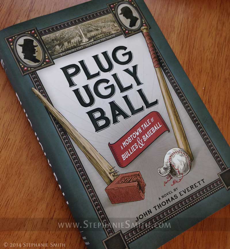
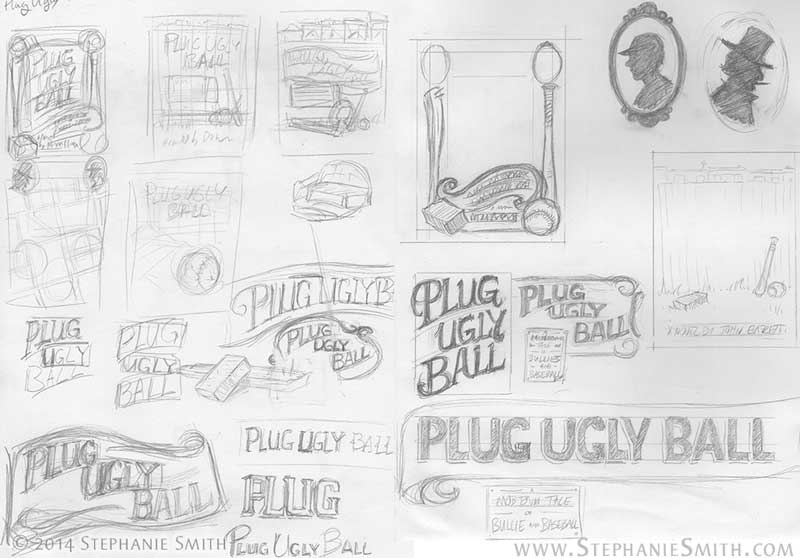
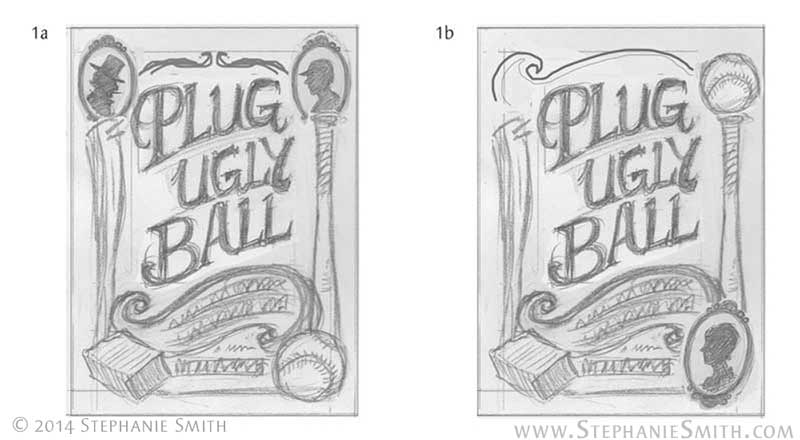
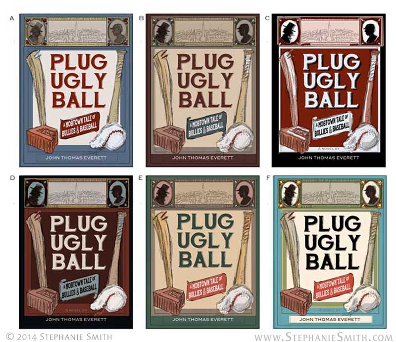
When we left off at the end of Part 1, I had a client-approved layout sketch and color scheme. Now it’s time to turn that into a real book cover!

Plug Ugly Ball Cover - Final Sketch
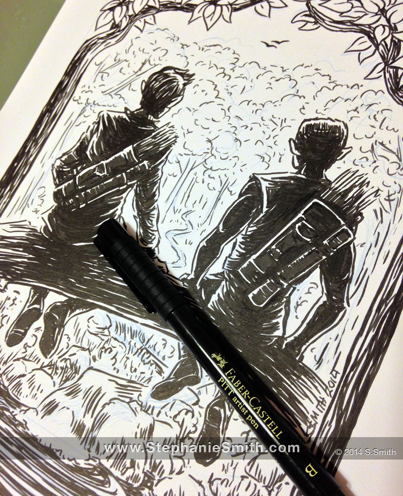
If you’ve seen any of my other art-process entries, you know I usually draw the actual illustrations on good old-fashioned paper before scanning them into the computer to add color and other details. This time, however, I used a completely digital workflow for the final art for two reasons:

1. While the interior illustrations were reminiscent of newspaper and fine-art engravings from the time period, which made them a good candidate for ink drawing, the cover illustration was meant to evoke posters and other signs, which tended to be painted in bold colors or use woodblock printing. Which would have required tools that would be difficult for the next reason…

2. Part of the time I’d be working on this, I’d be traveling. Keeping everything digital meant that all I had to bring with me was my laptop and drawing tablet instead of a bag of art supplies.

For digital artwork I typically use the Adobe products — mostly Photoshop but others as needed — and a Wacom Intuos drawing tablet.

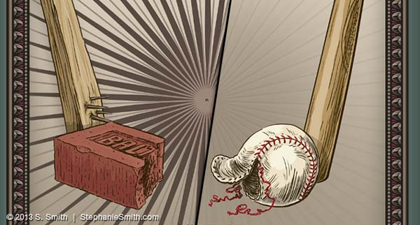
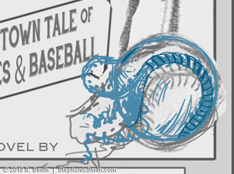
First, I opened my sketch in Photoshop and used the drawing tools to redraw sections of my source drawing that I wasn’t happy with, like this baseball.

Baseball Drawing - Sketch
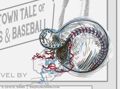
Then, on another layer, I drew in the linework, just as I would have with a real pen. This is the final version; I didn’t take screenshots as I went along, so I had to go into the different finished layers to pull out the samples for this article. Which means you don’t get to see all the erasing and redrawing and erasing and redrawing etc etc… lucky you!

Baseball Drawing - "inks"
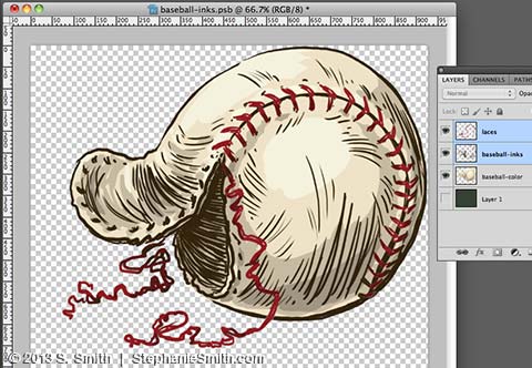
Finally, on a layer that went underneath all the others, I filled in a flat area of color and then added shading. Each element of the illustration was drawn separately and then all the layers grouped together in a “smart object” so they’d be easy to resize, move around, and add effects to.

Baseball drawing - Colors
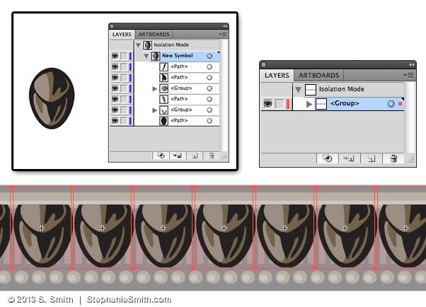
Once I had all the hand-drawn parts finished, I started in on the frame. I couldn’t find any patterns that would work 100% from my clip-art collection, so I built my own in Illustrator. This program makes it easier to make geometric shapes and build repeating patterns, so after I figured out the basic shape I wanted, I drew it in Adobe Illustrator and turned it into a symbol that could be copied as many times as I needed.

Vector Frame Drawing - Symbols
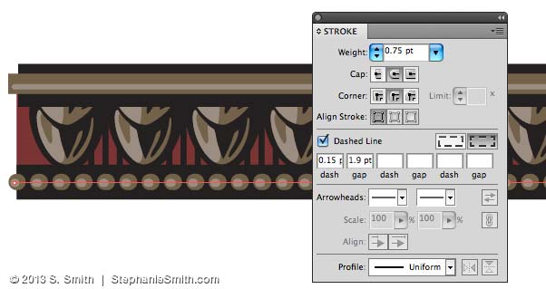
Other details were drawn in, including using the “dashed line” feature to make these little raised dots.

Vector Frame Drawing - Details
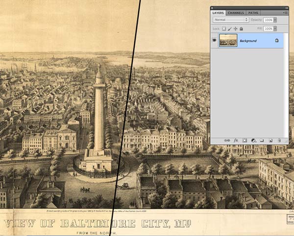
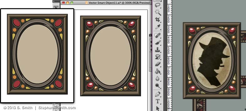
There were a couple other elements that proved easier to draw in Illustrator, like the picture frames in the corner, and the banner for the subtitle. All of these pieces were then copied into my Photoshop file as Smart Objects, just in case I needed to open them again in Illustrator to make changes — and boy did I! Here, the images on the left are in Illustrator and the last image on the right is in Photoshop, where you can see here how I’ve started layering in textures so it doesn’t look too crisp and clean.

Vector Frame Sequence
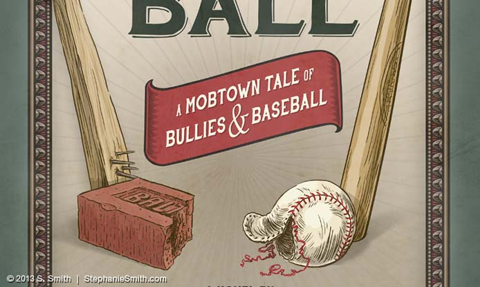
As the artwork started coming together — including adding the text (the font is the lovely HandShop from Fontscafe) — I needed to adjust some of the proportions and positions.

Plug Ugly Ball Cover - Artwork
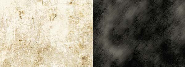
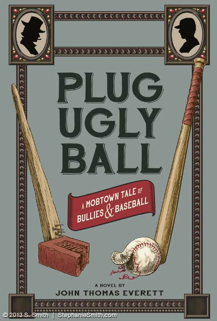
Now that I have all of the main pieces of artwork done, it may seem like it’s pretty much finished, but now it’s time for all the details that really make the cover come together: textures, shadows, shading, and other adjustments. But those will have to wait for the next installment!

UPDATE: Continue the story with Part 3!

“Artist at Play” prints for sale!

Work+Play-show-wall-ssmithAs noted in my last entry, I was honored to have my work chosen for display among 70 other illustrators from around the country (and the world!) for a group show during ICON, the Illustration Conference. The opening was this past Friday at the Land Gallery — an awesome little gallery and art shop in Portland, Oregon. It will be on display until August 24, sharing wall space with the likes of Allison Cole, Thomas James, and a boatload of other fabulous illustrators!

Even if you’re not in Portland, you can still take home a piece of the show.

From now until the show closes on August 24, you can buy an 8×10 archival print of my piece above, “Artist at Play” for the low price of $25 plus shipping (usually $5)

Buy “Artist at Play” now at buyolympia.com!

Take another look at the closeups in my previous blog post — or marvel at the blurriness of my photography here (the actual print is not blurry, I promise!)

Work-Play-show-closeup-ssmith

“Artist at Play” – new art!

Artist at Play - in progressLast month, I created a new piece for the Work+Play show at the Land Gallery in Portland — a group show in celebration ICON, the Illustrator’s Conference. Here’s a peek at the drawing when it was still in progress on my drawing table. I think this is the fastest I ever finished a piece this intricate — probably because I created it by throwing together all of the things I like to draw the most (except for myself… I’m not big into self-portraits!) and not thinking too hard about it for a change. Although I’m reserving the right to go back and tinker with the colors later….

"Artist at Play" If you’re in the Portland area, the opening/reception is Friday, July 11 starting at 8pm — but the show will be up for the rest of the month… and for a limited time there will be small prints available. I’ll post details about that when I get them. UPDATE: Until August 24 you can buy 8×10 prints from BuyOlympia.com. In the meantime, it’s kindofa big image, so click on it to see it bigger, and have some more details below! (also viewable on Behance)

"Artist at Play" detail"Artist at Play" detail with self-portrait

“A Moment of Reflection” in progress

Preliminary client sketches for a commissioned illustration

This recent commission was for a black-and-white image to be used as the cover for a short fantasy story, “Why,” written by Maggie Allen for author Janine Spendlove and published by the creator-run Silence in the Library Publishing as part of a Kickstarter backer bonus. The story is a bittersweet character study that takes place in Spendlove’s “War of the Seasons” fantasy universe. I worked with both Maggie and Janine to make sure I captured the style and spirit of the characters and setting.

Moment of Silence in-progressFor this drawing, I used the Pitt brush pen. I needed to work quickly and the brush pen is a good compromise between detail and speed. Although I used my light table to trace from the sketch, you can see in this picture where I made a few final adjustments in blue pencil before committing the drawing to ink.

Want to see the final product? Head on over to my Behance page! That’s where new finished artwork will be showing up, so if you’re a community member there Follow me to be updated when I add new work.

Making a Book Cover: Plug Ugly Ball, Part 1

 As followers of this blog know, I recently had the pleasure of illustrating the book Plug Ugly Ball: A Mobtown Tale of Bullies and Baseball, including the design of the book’s cover. Here’s a little peek inside the process.

Plug Ugly Ball book photo

Like any other illustration or design project, this one started with a long conversation with the client (in this case, author John Everett) about what he needed and wanted. Since I had just completed the interior art for his book, I was already familiar with its subject matter and themes. My client wanted to be sure his cover evoked those same themes and the time period the story is set in: the late Victorian era in the American East.

After a bit of additional historical and market research, I hit the sketchbook and filled up several pages with ideas about layout and typography, integrating some of the visual elements my client specifically wanted. They included more formal, structured concepts similar to the printed matter of the time as well as more pictoral concepts built around the ballpark and painted outdoor signage.

Taking into account current trends in book design and the need to avoid making it look like it belonged in the non-fiction section, I worked up four of the most likely ideas in rough form and sent them to my client. He wanted the cover to reflect the parallel in his story between the old Plug Ugly Gang and the rough-and-ready days of the early baseball league in Baltimore, so his favorite concept was the one that took that very literally, seen below on the left.

With his comments in mind I refined the design further. Ultimately we included some period art of the city itself as an inset and a few visual motifs from the other versions I’d presented. As the design came together, I started integrating color, producing a set of different colorways for the client to pick from. Some of the palettes were authentic to the time period, pulled from vintage advertisements — they were more vivid options, in fact — while others just “feel” more antique to a modern viewer.

Now that I had an approved design, it was time to start making the artwork. But that will have to wait for the next post!

EDIT: Part Two is now online!