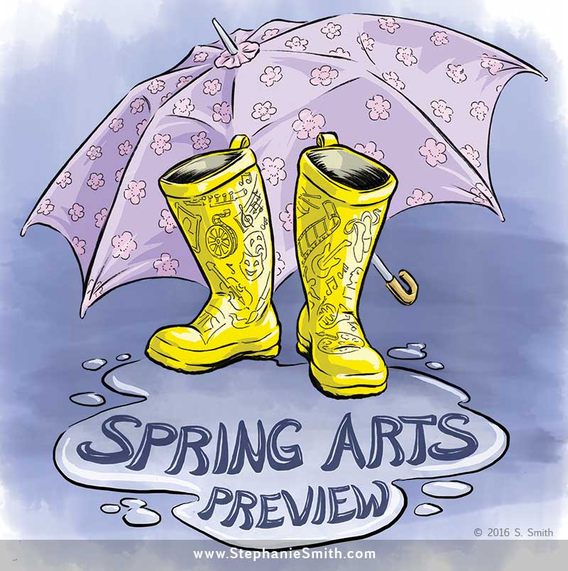
Illustration: Spring Arts Preview

Image

Spring Arts Preview for the Washington Post Express

Spring Arts Preview for the Washington Post Express  See it on Behance


I’m very excited to share this: this week my artwork has been published as the cover for the Spring Arts Guide section of the Washington Post Express, a free daily found in yellow newsboxes all over Washington D.C.

The art director said he wanted to capture the grayness slushiness of early spring, with the hope for brighter things to come. That made me think of all the bright, colorful galoshes that people wear in the wet weather, and the bright pink of the cherry blossoms that are usually the first signs of color in D.C.

I was introduced to the art director while attending an open discussion course at the new Baltimore Academy of Illustration to brush up on my business skills; Instructor and co-founder Adam Fine runs the editorial class there and tries to find real-world projects like this for students to submit proposals for. They’re offering online courses too, if you’re not in the Baltimore area… enrollments for the spring semester are closing soon!

This art was drawn on paper with a Pitt Brush Pen and colored digitally using, in part, Kyle Webster‘s excellent watercolor brushes.

Making a Book Cover: Plug Ugly Ball, Part 1

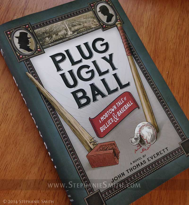
 As followers of this blog know, I recently had the pleasure of illustrating the book Plug Ugly Ball: A Mobtown Tale of Bullies and Baseball, including the design of the book’s cover. Here’s a little peek inside the process.

Plug Ugly Ball book photo

Like any other illustration or design project, this one started with a long conversation with the client (in this case, author John Everett) about what he needed and wanted. Since I had just completed the interior art for his book, I was already familiar with its subject matter and themes. My client wanted to be sure his cover evoked those same themes and the time period the story is set in: the late Victorian era in the American East.

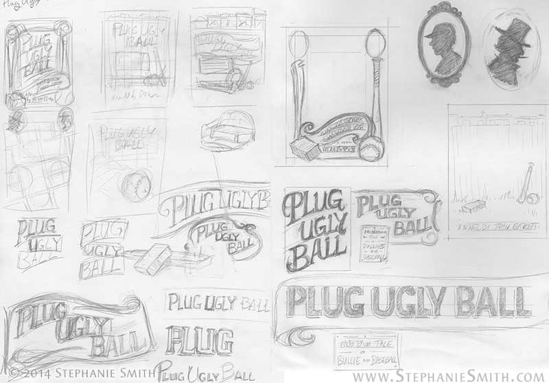
After a bit of additional historical and market research, I hit the sketchbook and filled up several pages with ideas about layout and typography, integrating some of the visual elements my client specifically wanted. They included more formal, structured concepts similar to the printed matter of the time as well as more pictoral concepts built around the ballpark and painted outdoor signage.

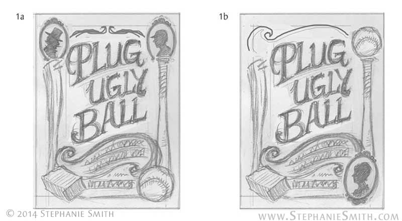
Taking into account current trends in book design and the need to avoid making it look like it belonged in the non-fiction section, I worked up four of the most likely ideas in rough form and sent them to my client. He wanted the cover to reflect the parallel in his story between the old Plug Ugly Gang and the rough-and-ready days of the early baseball league in Baltimore, so his favorite concept was the one that took that very literally, seen below on the left.

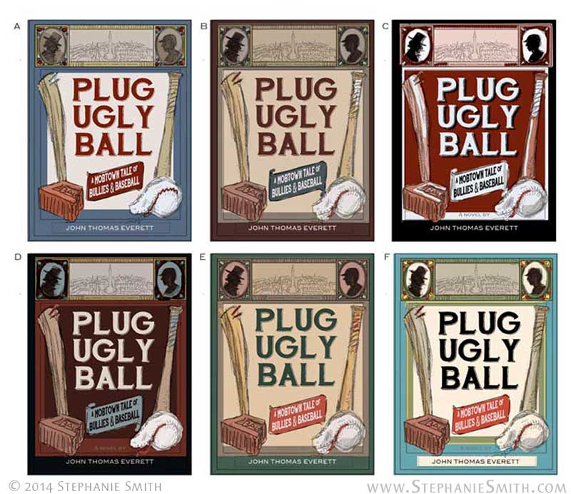
With his comments in mind I refined the design further. Ultimately we included some period art of the city itself as an inset and a few visual motifs from the other versions I’d presented. As the design came together, I started integrating color, producing a set of different colorways for the client to pick from. Some of the palettes were authentic to the time period, pulled from vintage advertisements — they were more vivid options, in fact — while others just “feel” more antique to a modern viewer.

Now that I had an approved design, it was time to start making the artwork. But that will have to wait for the next post!

EDIT: Part Two is now online!

Newly Published: Plug Ugly Ball

I can finally show you some work from a client project I’m particularly excited about! “Plug Ugly Ball: A Mobtown Tale of Bullies and Baseball” is a story of historical fiction by Maryland author John Everett. It covers the lives of a family over the latter half of the 19th century in the mean streets of Baltimore, sprawling across real historical events.

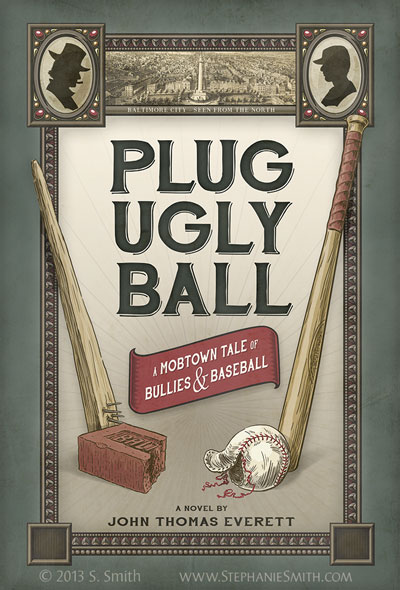
John wanted interior artwork for each of the main sections of the book that captured the feeling and style of the time, reminiscent of the woodcut newspaper illustrations of the period but depicting a specific scene from his story. And he also wanted a cover that would stand out on the bookshelves. In the end we decided for a more graphic approach in keeping with the posters and painted advertising signs of the period. Here’s the end result:

Illustration and Design by Stephanie Smith. Client: author John Everett

Illustration and Design by Stephanie Smith. Client: author John Everett

I’ll be posting another blog entry about some of the work that went into this cover, as well as that interior art, but for now I’ll just leave you with this:

Unlike most of my illustration work, this was created entirely digitally, although it started with pencil sketches and uses some scanned textures.

The fonts used in the cover design are from the Hand Shop family by Fontscafe — an awesome source for retro hand-drawn fonts!

The etching across the top depicts the Mt Vernon neighborhood where much of the story takes place. It’s from an 1862 etching published by E. Sachse & Co and can be seen uncropped and in vivid detail at the Library of Congress website (another awesome resource for history buffs!)

The book will be on the market by the end of the year, but for now can be pre-ordered at the publisher’s website, The Baltimore Bookworks, or at Amazon.com: Plug Ugly Ball: A Mobtown Tale of Bullies and Baseball

More to come soon!

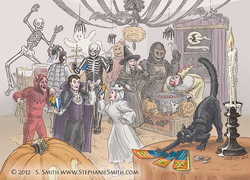
Getting ready for Halloween!

Illustration for lottery scratch-off Halloween promotion

Just in time for the season, another client piece! I wonder how many more-modern Halloween parties in the Northeast US this year will be disrupted by the storm currently bearing down on us…

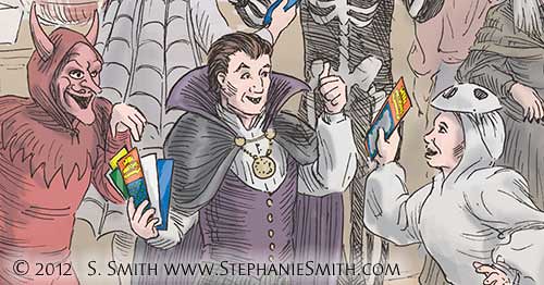
This might be the last picture from the series I’ve made for Cactus to promote scratch-off tickets for the Colorado Lottery, although they were a joy to work for and to draw so I can only hope there will be more. I posted one of my sketches from this piece on my Critterwings Facebook page, and plan to do that more often so you  might want to mosey on over that way…

Illustration for lottery scratch-off Halloween promotion

All the pieces in this series were created for an e-mail campaign about traditional holiday celebrations (with scratch tickets) and the coloring is deliberately subdued. Original drawing 12×14 inches, ink on smooth bristol paper, colored digitally.

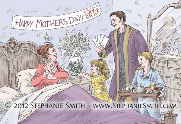
Happy Mother’s Day

 Celebrate the Seasons: Mother’s Day

Happy Mother’s Day to all the moms out there! I wouldn’t be where I am today without the love, support, and encouragement of my own mother. Love you, mom!

In honor of the day, here’s another client piece from the holiday series I’m drawing for Cactus. I don’t know if they actually made banners like that in Victorian times, but the client wanted it. 🙂

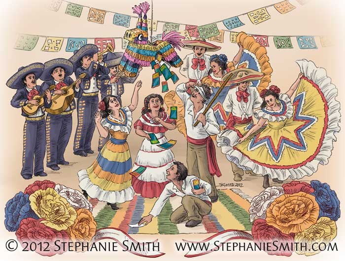
Feliz Cinco de Mayo!

Celebrate the Seasons: Cinco de Mayo

Wow, I thought I’d updated this blog at least once since the new year. All the more reason for a little fiesta to kick things off again! And on Cinco de Mayo, one of those holidays which has outgrown its origins, but what better excuse for a party?

This is another client piece I produced for Cactus to promote scratch-off tickets for the Colorado Lottery. I’ve missed posting a few of the holidays, so I’ll be playing a bit of catch-up. The project is almost done and I confess I’ll miss it. This was a fun one.

The Cinco de Mayo art is a bit brighter and more colorful than the rest, partly keying off of the traditional costumes and decor, and partly because it’s one of the few holidays on my list that doesn’t come from the Victorian visual tradition the rest of them do. We played around with the idea of making this art in a more graphic style reminiscent of Mexican poster art, but ultimately decided on greater consistency with the rest of the series.

More artwork to come soon, I promise!

Happy Thanksgiving!

I hope everyone out there is having a great Thanksgiving, able to spend some time with family and/or friends to appreciate all of the good things in their lives. Personally, I’m very grateful for having been born into — and married into — a loving family, for meaningful work that supports me, for a comfortable home to live in. These are the things that really matter, more than “Black Friday” and all the other craziness that goes on this time of year.


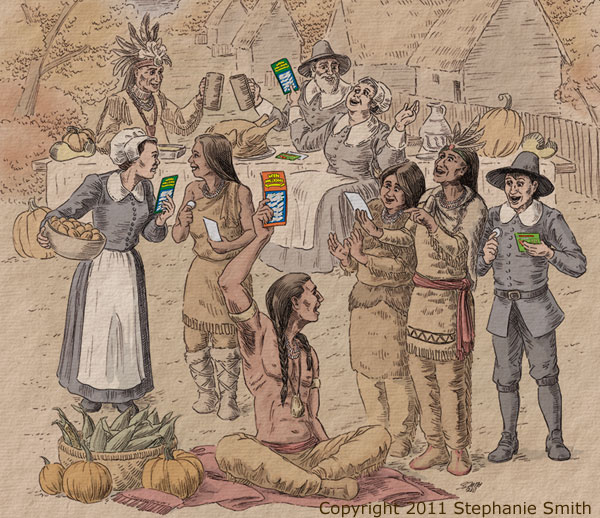
Thanksgiving With Scratchoffs
click to enlarge

So what’s up with this somewhat…. unusual picture? Well, one of the things I’m grateful for has been an increase in client work, but it’s been cutting in on my time for making “for fun” work. As a result, instead of something more personal I’m posting a recent piece I produced for Cactus to promote scratch-off tickets for the Colorado Lottery. It should be only the first in the series for a campaign called “Celebrate the Season,” which is already shaping up to be a lot of fun. They wanted an old-fashioned look, so I drew it in ink to simulate an engraving and added subtle tints to color it; the rest of the series should be in a similar style. I produced this one in record time for the complexity of the drawing, and I look forward to taking a little more time to lavish details on the rest of the series.

I wish you all home, health and happiness for this holiday… have a good one!   

Brushing the dust off the blog…

It seems like I turn around and BAM realize I haven’t made a blog post for over a month and a half. Blame it on the crazy, hazy days of summer. This year it’s been the crazy HOT days of summer around here: we’re officially tied for the most days over 90 degrees in a single summer, and it seemed like we definitely got more than our usual share of 100+ days too.

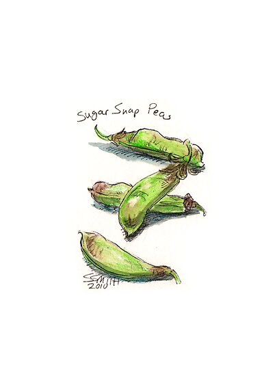
I spent some of the time I was hiding indoors where it’s air-conditioned at my drawing table, working on my flower alphabet, playing around with materials, and keeping my hand in with sketches, including some rather silly ink drawings and experimenting with watercolor pencils, like in the small piece above. Most of that work has been posted directly to my RedBubble portfolio, I’ll try to remember to cross-post here as well.

I’m also slowly adding new products and upgraded artwork to my Chinese Zodiac series at RedBubble and at my Zazzle store, generally trying to get ready for the holiday season (I can’t believe it’s already time to be thinking about that!) As always, if there’s a particular product that you’d like to see one of my images on, just let me know!

Stickers! In Denver!

Yay, stickers

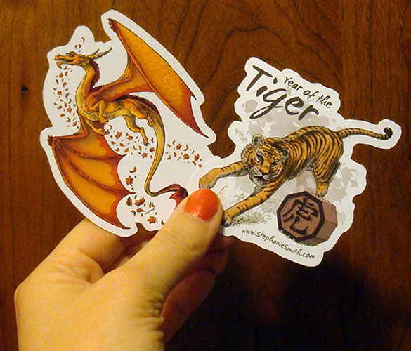
Look what arrived this week, just in time for me to bring with me to the InHowse/HOW Design conference in Denver! These are the new die-cut vinyl stickers from Redbubble, and they live up to my expectations. If you’re there, find me and I might have one to give you!
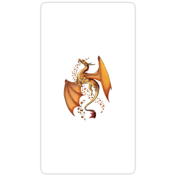
I’ll have a very limited number of these with me at the conference, but you can always order your own — without the website on them, I made these up special for myself 🙂  Any of the T-shirts in my RedBubble site can be ordered as a sticker instead of a shirt, just click on the “buy/preview” button and choose the Sticker option at the top of the screen. For reference, the dragon is about four inches tall.

I’ve also finished a super-quick but much-needed remodeling job on my main website. (This blog is next in line for a makeover, but it may take a while before I get to it.)

Stephanie Smith Illustration

Between preparations at work and at home for this trip, there hasn’t been much time for new drawings. Hopefully, I’ll be able to make up for in some part in between waiting at airports, spending 5 hours on a plane, and doing some sightseeing in Denver tomorrow. After all, June 5 is Drawing Day! I won’t have my scanner, but I’ll have my camera and my laptop, and will try to post *something* over the weekend on my RedBubble site. See you there!

New Critterwings products from RedBubble

The folks over at RedBubble have been hard at work these days! First, they added postcards to their product list, along with the cards and prints. They’re letting YOU choose what month you want your calendars to start with, so if you needed one that starts any other month besides January you can do that too. Then they added hoodies to their lineup of shirts, and you can choose if you want the image on the front or the back. EDIT: And they’ve also added baby and kid’s T-shirts to the lineup too! RedBubble does some of the nicest on-demand T-shirt printing I’ve seen so this is great news.

But this is one of the coolest things I’ve seen by far: die-cut stickers.

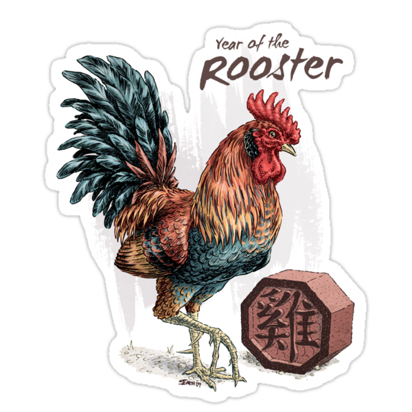
Year of the Rooster StickerDragon of Autumn sticker at RedBubble.com

That’s right, any one of the designs in my T-shirt gallery at Redbubble can be ordered as a large (about 3″) vinyl die-cut sticker. Just click on the “buy/preview” button for any T-shirt and choose the “sticker” option — I’m loving the way the Chinese Zodiac animals look! If I needed any more motivation to add more T-shirt designs to my collection, I have it now… 🙂